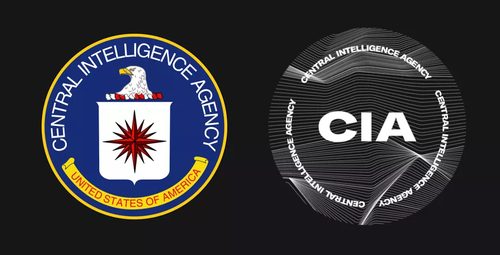
The CIA's new rebrand includes a refreshed logo (below) which retains its predecessor's circular shape – and very little else. With its bold, black-and-white typeface and wavy lines, the internet is wondering whether the CIA has been taking logo design inspiration from techno music posters.
And of course this is all supposedly in the name of "diversity" and appeasing the cult of the woke.
The new logo can be found on the CIA's new recruitment website which is part of a broader initiative to create a more culturally diverse and sensitive intelligence agency that includes "people of all backgrounds and walks of life".
The Associated Press writes of the new rebranding and culture shift within the agency: "while the CIA has been diversifying for years, intelligence agencies still lag behind the federal workforce in minority representation."
CIA's verified Twitter account has also been busy virtue signaling its new "diverse faces" as part of the initiative:
"We're woke now!" journalist Rania Khalek begins in a spoof video covering the major rebrand.
"Don't worry, we'll still be overthrowing democratically-elected socialist governments and putting despots in power."
"But we're moving with the times here at Langley and we don't want the white patriarchy giving orders.... We want trans torturers... It doesn't matter if you're from a minority, as long as you have no moral code."
The rebrand is further being widely laughed at on Twitter and other social media...
We highly doubt that any of this has foreign enemies or terrorists at all worried.
Instead, it's likely they're laughing right alongside the internet, and all too glad the CIA appears to be this preoccupied with projecting with its 'diverse' image instead of focusing on gathering actual intelligence and engaging in national security matters.

You need to be a member of 12160 Social Network to add comments!
Join 12160 Social Network