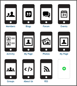
We’re happy to report that by the end of this week a new mobile experience will be rolled out to all Ning Networks. This upgrade is a complete re-write of the old Ning mobile experience. It’s built-in, completely free, and offers a lot more options for driving activity.
The contrast between the old and new couldn’t be more different. The old mobile interface was originally released around the same time Apple unveiled their App Store. We’ve been upgrading the mobile version regularly over time, but we knew it was high time for a thorough rebuild and redesign. We chose future-friendly HTML5 because it allows us to create a great-looking experience across numerous mobile devices. We were able to create something that’s high quality and that provides a frictionless experience for users. And it’s an excellent base for adding more to the mobile version down the road. Let’s take a look at a few things the new Ning Mobile offers.
A better app-like experience for your members
The old and new are radically different, but the look of the new probably won’t throw you for a loop. It’s designed in a familiar app-like way. It provides the same kind of swiping and tapping gestures most people are used to performing with their iOS and Android devices. It’s optimized for smartphones so your members can access it easily with the devices they already use every day. You won’t need any advanced design skills or a $100 Apple App Store developer’s license to publish, either. The new mobile version will be consistent and running in the background all the time. Most important: It’s very stable.
More pages, more options, new choices
 While the old version didn’t provide many options for customization, the new Ning Mobile lets Ning Creators choose which features and pages they want to appear — in the order they prefer. There’s also many more features available in the new mobile experience. You can add pages to display Latest Activity, Members, Blogs, Photos, Forum, a member’s Profile Page, Groups, Events, an RSS feed, and even custom HTML pages. This greatly expands a Ning community’s mobile presence and possibilities, and we’re excited to watch as the entire Ning Platform adopts this new mobile version.
Most of the administrative settings will probably be pretty self-explanatory. A few details to keep in mind:
- Design details: The Ning Mobile site is standardized for design consistency, but there are a few branding options for Ning Creators to take advantage of. You can upload a logo to replace the name of a network in the header or change the background color of the header. A preview mode is also provided to see what it all looks like before committing to a change.
- Choose your pages: Ning Creators can choose the pages they wish to display and how the data on the pages is sorted (e.g., by “Latest Activity”). Some pages include choices about whether to show or hide preview-style content. Don’t like the order of pages? Ning Creators can drag and drop them and reorder them to their satisfaction. The first one listed will function as the “Main Page.”
- Opt-out option: Don’t want a mobile version? We’ve got you covered. If a Ning Creator removes all of the pages from the Mobile section of the dashboard, visitors will instead be shown the desktop version of your Ning Network.
- Back-out option: We’ve included a “Desktop View” for any member or visitor who wants to switch off the mobile version and rely on the standard desktop view.
As always, we’re big fans of our customers’ opinions, so let us know what you think about the new mobile version, either here or on the Creators Network. How have your members used the mobile version of Ning in the past? What can we do to help make their mobile experience even better going forward — and make your community even more vibrant and active?
You need to be a member of 12160 Social Network to add comments!
Join 12160 Social Network